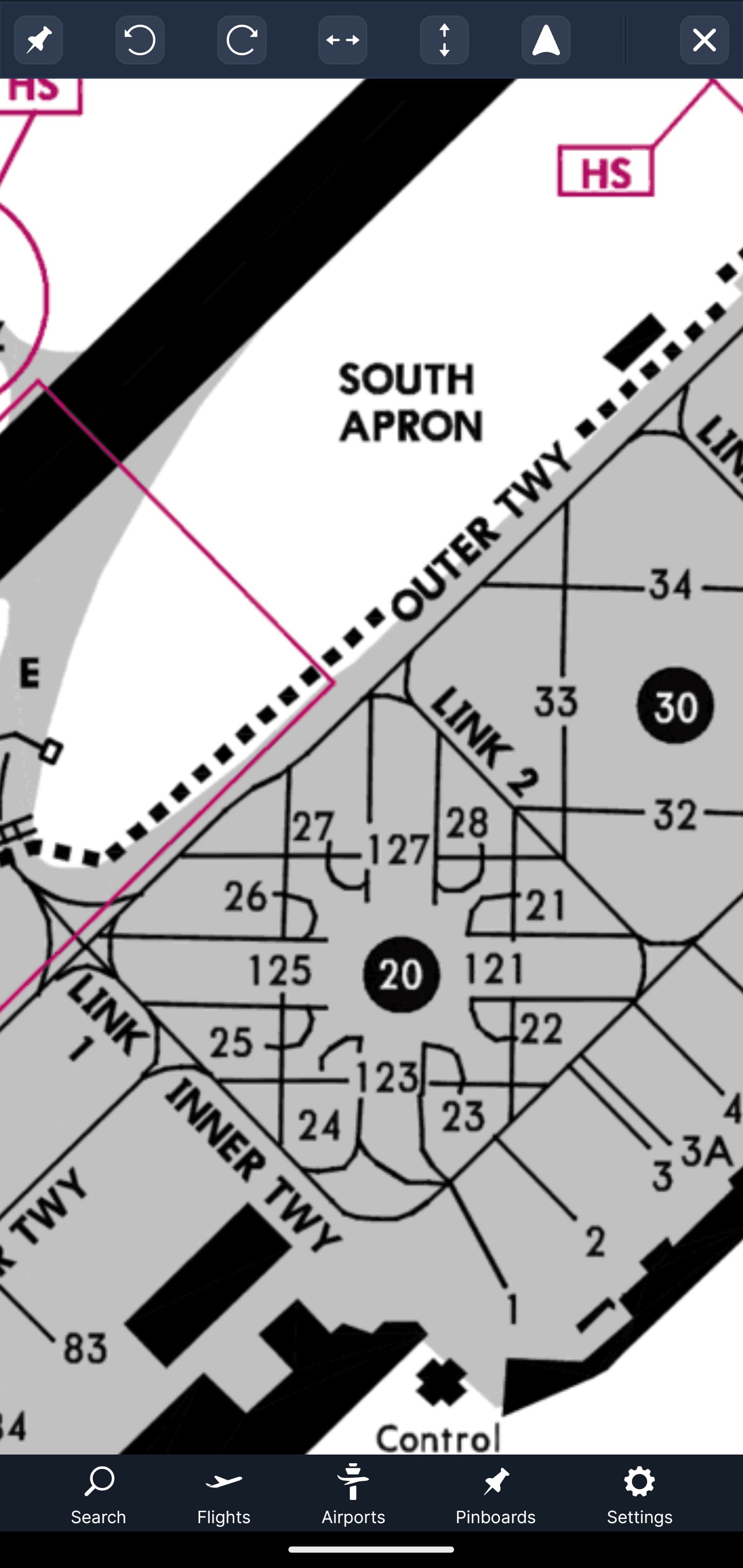
As example I uploaded a part of the lsgg diagram and chart. On the “old” chart you can clearly see where the stands are, for example 21, 121 and 22.
On the new airport diagram these stands result in one string “2221121”.
This is how the data is delivered when the gates are too closely positioned. We’ll see if there is something that can be improved, but for now when gates are closely spaced the labels are grouped like that. Again, we’ll review this.
I understand that it’s only on gates close to each other or generally just when there are different lines for different aircraft sizes.
Just wanted to bring it to your attention. Would be great if it could be handled somehow, but if you already get it like that I understand if it’s not possible to improve it from your side.