Good morning! I recently got Navigraph and thinks its great, good job!
I just want to point out something, and I don’t know if it’s a Navigraph thing or on Jeppeson’s side (as I think Navigraph uses Jeppeson).
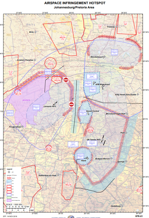
The graphs doesnt show all the VFR routes around certain aiports, it looks mostly like its around FAOR thats it’s missing (Our busiest airport). Some airports like FACT do have it correctly.
We get VFR routes from the SACAA site here: https://www.caa.co.za/industry-information/aeronautical-information-vfr-charts/
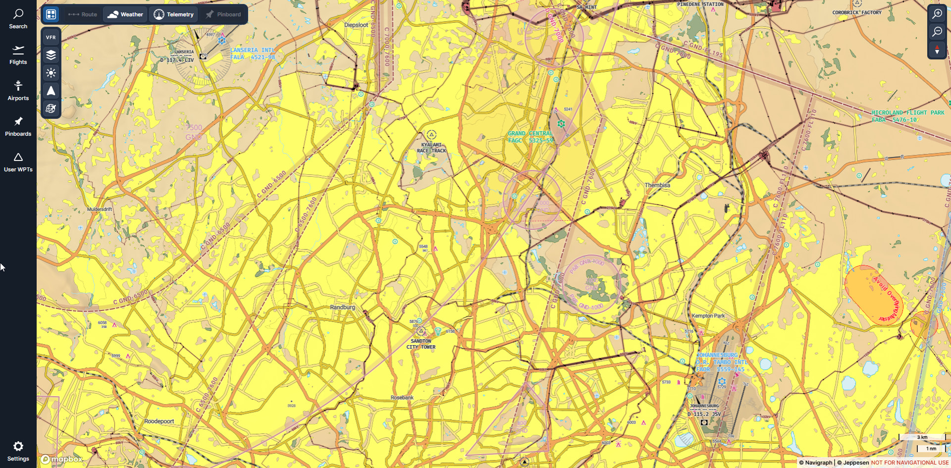
Below image shows the three VFR routes around FAOR. It’s not shown on Navigraph VFR. Whats interesting is, that Navigraph shows the reporting points as waypoints, but not routes like it does for other airports.
How it looks on Navigraph with waypoints and no routes:
Below example showing FACT showing routes correctly:
